Product Microsite
Foligain Hair Regrowth Serum Microsite

Foligain aimed to create an engaging and informative mobile microsite for their Hair Regrowth Serum to
enhance user experience, educate customers, and boost conversions. The microsite features a
personalized quiz, application tutorials, testimonials, and seamless purchasing options designed to guide
users through their hair restoration journey efficiently and confidently.
The goal was to design a mobile optimized digital product companion (microsite) for Foligain’s Advanced
Hair Regrowth for Men serum. The microsite aimed to enhance user experience, promote adherence to
the product, drive reorder rates, and increase average order value through interactive features,
personalized guidance, and seamless shopping experiences.
Challenge
Hair regrowth is a sensitive and confusing journey for users, often leading to low adherence and
premature discontinuation of treatment. Foligain needed an innovative, engaging, and informative
mobile platform that:
Educates users on product application
Builds trust through proof and testimonials
Simplifies reordering and subscription processes
Offers tailored guidance based on individual needs
Integrates seamlessly with product purchase flows
Research Phase:
Brand Consistency:
Analyzed Foligain's existing website to understand their brand identity, color palette, typography, and visual language.
Visual Hierarchy & User Needs:
Studied the website's content structure to determine the most important elements, like product info, testimonials, and CTAs, ensuring the microsite aligns with user expectations.
Competitive Analysis:
Reviewed competitor health and hair-care microsites to identify best practices in engagement, navigation, and trust-building features.
User Experience:
Focused on creating an intuitive, seamless flow that simplifies decisions for the user, including personalized guidance and easy reordering.
Design System Creation:
Colors:
Extracted from the Foligain website, emphasizing trustworthy blues (#0193AB), accents of red (#E44C22) for CTA buttons, and neutral greys/whites for backgrounds. Used these colors consistently across the microsite for brand recognition.
Typography:
Button Styles:
Designed primary and secondary buttons with distinct color schemes:
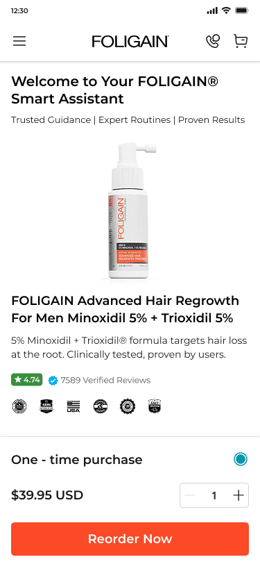
Primary Buttons: Bright red (#E44C22) with white text, used for critical actions like "Reorder Now" or "Subscribe & Save"
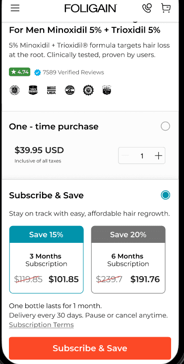
Secondary Buttons: Blue shades (#0072c3) for secondary actions such as "View More" or "Submit"
Spacing & Layout:
Used ample spacing, consistent margins, and grid structures to create a clean, organized interface that mirrors the website's professional look.
UI Elements:
Created consistent styles for sliders, input fields, icons, and image placeholders, aligned with the brand’s aesthetic for visual harmony.
Components

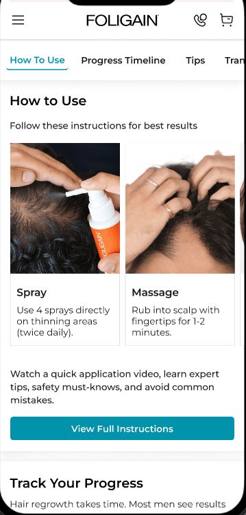
Educational Content
Video tutorials and infographics demystified treatment steps.
Trust Building
Testimonials and clinical proof reinforced credibility.
Seamless Purchase
Simplified checkout and subscription options increased purchase likelihood.
Clean, brand-aligned Design
Clean, brand-aligned visuals with vibrant CTAs optimized for mobile, ensuring an intuitive user experience.
Design Solution
Streamlined flows for new users: Reorder Now vs Subscribe & Save reduce decision time
Mobile-first focus: Optimal tap targets, readability, and faster load times
Clear CTAs and visual hierarchy: Guides users to purchase and subscribe easily
Self-serve guidance: Learn How to Use and Progress/Testimonials empower informed decisions
Brand trust: Consistent visuals (color, typography, buttons) boost recognition
Social proof: Before/after and real-life progress timelines build credibility
Transparent terms: Clear subscription options increase confidence
Flexible purchasing: Easy switch between one-time and subscription purchases
Engagement through progress: Lightweight timeline keeps users returning
Reorder/upsell readiness: Smooth access to reorders and bundles boosts AOV
Accessibility: Good contrast, readable text, and concise content
Data-ready: Clear metrics for conversions, subscriptions, and engagement
Scalable design system: Reusable components for quick iterations and maintenance
Future-ready: Easy to add products, bundles, or regions without redesign
Sales Increase: 30% uplift in product reorders within three months.
Conversion Rate: Improved by 20% due to personalized guidance and streamlined checkout.
Customer Feedback: Positive reviews highlighting increased trust and confidence in the product.
Subscription Growth: 35% more users opted for recurring orders, ensuring ongoing engagement.
This microsite successfully transformed the user journey by fostering trust, simplifying decision-making, and encouraging repeat purchases, significantly impacting Foligain’s bottom line.